Saturday 20 January 2018

OUGD601 - Final and Evaluation

The aim at the start of this brief was to produce a practical response to the essay question: To what extent have the technological advancements seen within editorial design impacted the creativity of designers. To help combat this a specific target audience was identified from the arguments within the essay. The informative website was a successful way to engage my young designer target audience. When trialled on design students they described it as being informative, interesting and easy to use. This was positive as these were some of the aims set out at the beginning of the brief. The only suggestion given by the target audience was to have some sort of interactivity. This may have brought more life to each page as one could have changed into the other. Despite this, the work produced successfully did what the brief asked, helping teach inexperienced designers about the different editorial styles.

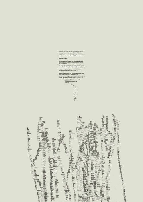
The website that was created as a final outcome portrayed the results from a series of interviews conducted as primary research for the essay. These responses are shown in two different ways. The first is modernist, rule abiding and based on a simple grid system whilst the other is more rule breaking and ambiguous. Each layout has been greatly informed by research on modernist, post modernist and dadaist design. Rule breaking design styles that are popular today were also researched in great depth which in turn helped to inspire the final layout.


Overall this project has been successful. The work produced has been well informed by the essay and research alongside it. Although still having editorial qualities, being portrayed through a website means the outcome is easily distributed. This is also appropriate for the identified target audience as young designers are more likely to visit a website than pick up a book. 

My final website can be visited using this link. However, a video can also be seen below.


OUGD601 - Feedback 2

My second piece of feedback came from numerous different sources. I first asked for feedback from my tutor Alec who incidentally is featured in my editorial. He first noticed few minor grammatical errors were spotted on the 'About page' which are easily fixed. He then noticed it was difficult to understand whether the text in the centre of each page was the title or the switch. As this is an important part of the website that enables users to switch between experimental and rule abiding design he suggested that the contrasting layout was suggested using type. This was improved by creating a typographical experiment using various different typefaces similar to the Dadaist work I looked at within my research. This helped to understand where each f the links take you. This change is seen below:


I then brought my updated website to some course mates for feedback which was mainly positive. They did however have some contributions to help me improve the usability as well as the design of the site.

The first point this group made was that the start could be more obvious. They suggested giving the user a choice which path they should take at the start as this would be easier to understand rather than jumping into the first editorial. The landing page I made in response to this feedback is below


As this was to work as an educational tool for young designers, the crit group suggested I gave an explanation for each page and what it was inspired by. This was linked by the 'About' button on each page.

The suggestion was also made that I changed Steven Hellers page so it was more eye-catching and so also more fitting for its post modern inspiration. To solve this I took away the border behind the layout. Although this differed from the layout of the other rule breaking designs, it was appropriate for the post modern ideas which often were similarly unpredictable.


OUGD601 - Production

The next stage in the design process is to start creating the final layouts for my website. Through experimentation I was able to decide on some of the different parts of my final outcome. It was decided that the background fill will be coloured for each of the rule breaking spreads. This opposes Modernist ideas and also is more eye-catching which means there is more of a differentiation between the two opposing parts of the website. These will be chosen through further development of the site.

The editorial layout each page will be constrained within a box. This will means there is regularity between the spreads and therefor the site won't look disjointed. Although the modernist pages may appear to be boring compared to the rule breaking ones, they must be clear and legible so the interview responses and modernist design of the page can be acknowledged by the reader.

I created wireframes for the website as they aid the production of my website by helping me plan what is going where. This also enabled me to experiment with the placement of other things that must be included such as links and arrows to move across the screen.


Typefaces
The most appropriate typeface must be chosen for this online editorial. As previously decided, I will be using both a sans serif and serif typeface within each page. For this I chose Times, a classic typeface paired with Apercu a modern sans serif typeface as this pairing is similar to how my publication combines the old and new.


After experimenting with each of the different processes involved on each page, I started to create a number of versions of each typographic layout and composition which were then shown to a critique for feedback.

Each one of these designs had progressed at different speeds because of the different production methods used in the layout.

Heller
To help me with this page I first compared my experiments with my previous research on post modernism. The hectic layouts in Raygun helped me visualise my experiments however I felt producing this layout on illustrator would lead to a better final outcome. To do this I scanned in my experiments and produced two different ambiguous layouts which were very different but still used the same experiments I created earlier in the project. 


Between these two ideas, the top was chosen as the critique felt it best considered where each element way placed. Although it was based on the overlapping techniques in post modernism my critique thought it looked rushed.


Carson
The Dadaist style I used as inspiration came through within my experimentation. This was applied to the work I did on the different page options however I also took into account Carson's own style.


This design above was based off pages of Raygun where multiple sections of body text are layered over Carson's name. The bright pink colour is used to contrast the monotone colour scheme of the modernist design.


The use of grey on black here make the type experiment more ambiguous. The us of dark text on a dark back ground is also something Tschichold identified as wrong as the text become hard to read. Because of this layouts contradicting design it was chosen in the critique for use within my final website.

John & Alec
Although some sketches were produced for this layout, I had previously decided that it would all be produced using design software rather than any manual processes. The design of the layout was attempted numerous times as the aesthetic were a priority in a design where function follows form. One of the main ideas for this layout was to disobey as many modernist design rules as I could.


I chose a light blue to use as the background for the final layout. This will also be used as the fill for the rest of the page. This colour was chosen as it is suitable to may of the minimalist designs that are seen today. An image is placed in the centre of text, apposing one of Tschichold's rules. The serif typeface Times is used for headings, contradicting the san serif body text. Some quotes are oversized and text boxes have been restructured.


Modernist Layouts
The Layouts that were produced the fastest were the modernist, as they followed a strict grid and canon. My previous research on Jan Tschichold's The New Typography meant I was familiar with the constraints that the layouts had to follow. I produced only one of each of these pages for feedback during the critique as I was confident that they were appropriate for the website.


Contents Page & Questions
These layouts would have to be functional so the user can be guided around the site however some of my final page ideas were experimental and hard to read which was appropriate for its relation to todays rule breaking design.


Once each of my layouts had been chosen, the final production of the website was in order. Prototyping was done on Adobe XD as it enables me to test out the website with the functionality of links. This would also enable me to show a client the website before are coder is involved.

The wireframes I produced helped me to put work in the right order. It also meant there was little to do when it came to putting everything together. There were however some elements that were added to improve the usability such as adding arrows to each page so users didn't have to keep switching back to the contents. I also decided to show the 'about' link in a more experimental way to better portray the rule breaking layout in this part of the website. Although using the same previous typeface, each link was typeset differently to add ambiguity.


OUGD601 - Development

I produced sketches of different ideas for each of my pages which has shown me each of the ways my layouts can be progressed. It also meant I wouldn't miss any of the experimental ideas that have been inspired by research, within my final layout.

Steven Heller
Using my visual research and what I have learnt on post modernism I started to plan the traditionally produced Heller layout.


I started my experimentation by creating typographic compositions using printed text that is cut out and stuck down again. This is similar to some of the more recent type experiments seen in my further research.


I then produced similar experiments using the computer. These were then printed out and manipulated using scissors. The scanned in results are below.

Looking at Heller's work I noticed the use of hand drawn type. I experimented with different lettering within a sketchbook taking inspiration from one of his poster designs.


The next stage in the design process will be scanning all my experiments in and looking at how they could work as a composition.

David Carson
Dadaism was the main inspiration for this composition however the squashed type is similar to some post modern work I looked at within my research.


I produced some typographical designs using illustrator, showing how this work can be easily produced today.


After experimenting with this style, I believe that keeping the is best to stay true to both post modernist design, of which Carson was part of and Dadaism.

Alec and John
These pages were to be produced similar to digital work today that opposes modernist ideas. On this page form is more important than function. The layout will be completely experimental and produced digitally. The text must be largly readable.


I jumped straight onto InDesign to experiment with this layout. Using a very simple grid system I started placing text and image in different places. As I develop this layout I will split it off into separate looking spreads to give me a choice when progressing. The grid will also start to become more complex as I add different experimental aspects.


Other Pages
These pages would be based on many modern editorials disregard for rules. The pages will include type experiments created digitally and will vary is design.

Contents

Questions


Friday 19 January 2018

OUGD601 - Deciding Content

After the previous critique, I had decided that the final outcome would be an informative website where users can learn about the various different types f editorial layout. There will be two sections to the editorial. The first will document my interview responses in a strict modernist style. My previous research on Jan Tschichold and modernist design will be useful here.

The second part of my editorial will be far more experimental and will reference the different rule breaking design movements throughout history. The website will also include references to how the modernist rules are broken today.

I created a site map to give me a better idea about each page I would be making.


I wanted each designers page to reflect their own style of work. It must also link well to another appropriate design movement.

Steven Heller
Heller is predominantly a design writer however, of what work I have, type in often hand drawn and placed randomly on the page. Further, more in depth research will be done next.

This page will be designed in an illegible postmodern fashion. Although I have identified that this is similar to much of Carson's work, I want it to be differentiated by Heller's hand drawn style.

I feel this experimental layout should be produced using mostly traditional methods. This will be similar to how post modern work was previously created. It has been inspired by talking to the retired graphic designers who discussed the processes they went through to complete the practice before 1980.

David Carson
Although Carson revolutionised Post Modernism, his quote was short so felt this page was better suited to take inspiration from Dadaism as well as a more modern graphic style. Despite this, I think researching Carson's work further could help to inspire the layout.

Alec and John
As these designers are my tutors and less well known than the other interviewees, I felt this page worked best to portray the modern graphic styles which break modernist rules. The aim for this page will be create a visually pleasing composition that disobeys everything Tschichold advises.

Unlike the other pages, a grid system could be used effectively to set out type and image however this could be complex and set type out in experimental ways.

Other Pages
I decided that my pages that didn't contain interviews would focus on the experimentation of type and whether legibility and rule breaking within modern graphic design is still acceptable. Although similar to the Alec and John page, it will disobey even a grid system similar to how many publications do today. 

OUGD601 - Further Research

As this project has progressed as far as deciding how each page of my website will be created, it is important that I concentrate my research to help inform my work. There were various areas I looked into to help me.

Websites
I looked for websites with postmodern characteristics as felt they may help inspire the rule breaking part to my editorial website.

I found some interesting type foundry websites which didn't conform to any rules. Type is animated across the screen and imagery is placed inconsistently. This works well and fills the whole screen adding to its intensity.


The designers republic online archive is interactive, using noise and animations when the mouse is hovered over links. Type is placed close together making it sometimes difficult to click the right link.

Evolution prints displaces an image across its home page. The large type is abstract and eyecatching.


Individual page research

David Carson
As the quote here was short, I decided that I would take inspiration from different design movements. The first being post-modernism, of which I could look at much of Carson's own work. Aspects of Dadaism will also inspire the layout.

Steven Heller
I have decided to do this page in an illegible postmodern fashion. Although I have identified that this is similar to much of Carson's work, I will take Heller's own style into account when designing the layout.


Raygun magazine can also be used to help inform the design.


Alec and John
This spread looks at modern design how good work doesn't have to base itself off the modernist ideals. Here I will be looking to disobey as many rules as I can whilst still producing a visually pleasing piece of design.


Other Pages
I decided that my pages that didn't contain interviews would focus on the experimentation of type and whether legibility and rule breaking within modern graphic design is still acceptable. Although similar to the Alec and John page, it will disobey even a grid system similar to how many publications do today. Because of this, I looked for experimental type pieces.