This brief asks me to create a piece of work based upon my essay. I decided to note down some of the main topics within my essay to help me start my practical work. I looked for some of the issues that I felt were most important and where the problem hadn't been raised in the media. This can be seen below:

One topic that stuck out most for me was The Perfect Body ad ran by Victoria Secret I noticed both the male and female gender can be negatively affected by the sexualisation of women. Because of this, I decided to look further into their ad campaigns and ideals.

When researching for my essay, one thing that became most apparent about the underwear shop Victoria Secret were the number of their ad campaigns with sexist undertones running throughout. Despite this, I found the backlash of abuse about their ad from companies such as Love to be inspiring. Because of the growing awareness of the issues surrounding sexism in advertising, the public have also become more inclined to react against such ads as the perfect body campaign, typically hounding the guilty party's twitter with hashtags of abuse. Despite this, Victoria Secret and similar companies continue to run the same controversial ad campaigns that sexualise women with an unobtainable body to sell their products.


One thing I noticed in my essay was how their were similarities between the modern ads of companies such as Victoria Secret and ads seen in history that were renowned for being sexist. I had the idea to show these sexist traits in a number of posters. These posters will be in an old poster style to show the sexist links between old and new ads.
I have decided to look at a number of poster styles on which to base my work. The styles I have looked at are:
Swiss Poster design
Grid systems play a big part in this style which started in the 1950's and was popular in design till the 70's. The eye catching qualities of this style put this in contention for my poster style.


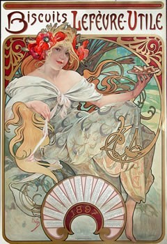
Art Nouveau
This poster style is similar to many sexism posters I looked at in my essay research. The illustrations are coupled with detailed, hand drawn type.


Object Posters
These often have illustrated close ups of objects on them. This may work well for my subject area as the type is often bold and eye catching. It may however be hard to convey the message I wish due to the limited type on them.


As I am unsure which direction I am to take my project, I have decided to bring my ideas to my upcoming crit. Here I hope to receive help with which poster style I am to base my work as well as whether anything can be improved so far in my whole brief.
_______________________________________________________________________________
One of Victoria Secret's recent ad campaigns has shown me how they have continued to sexualise women even since the Love my body campaign. This ad campaign is for their Bombshell Fragrance. I have used the body text from some of their ads for content for my own work.

Another Victoria Secret ad I have found seems to force young, easily influenced people to believe that the model in the photo is in fact 'curvy' whilst in fact she may be healthy or even underweight.

After gaining critique feedback on my developed ideas for poster design I have decided to work in a swiss style. Not only is this style eye catching but will work well to communicate my ideas on sexism.
I have decided to look further into this subject to help me with my project. The posters below are in a swiss style. I want this research to influence my own work as I focus on different aspects with the design style.


These swiss posters show how I could use photography within my designs. The obvious grid system is consistant through both posters and keeps to the swiss rules.


The posters above show more illustrative swiss posters.
_______________________________________________________________________________For my first poster I wanted to create a design that showed what the sexualisation of women is doing. This is similar to the concept of the male gaze which says:
'The male gaze, which refers to the lens through which mostly white, heterosexual men are viewing the world, is a lens of entitlement. It's entitlement to all of the privileges awarded to gazers, entitlement to view women (and even to touch them!), and to discuss and exploit their bodies without consequence.'
I experimented first in my sketchbook. I wanted as many ideas as possible so some sketches were vague whilst others were more detailed.

My development for this was done on illustrator as I felt the colour of the work I produce could play a large part in the design process and this is better shown on the computer. This can be seen below:


I decided to look at the Victoria secret website where I found a consistent colour scheme of black, pink and white. I then applied these colours so my work. I also decided to remove the arrow from the left eye to make it gender neutral. I think this also works better with my new colour scheme to better show the effects of sexualisation.


I want to next ask the opinion of other designers about my newest outcomes before I progress on to my poster layout. I feel like I need feedback on the new colour scheme and whether to change the design at all.
_______________________________________________________________________________
I want to look more in depth at artists who practiced the swiss style. One designer that stands out is Josef Muller Brockmann. The grid systems within his work are obvious and are coupled with simple shapes and the bold use of helvetica which is consistent across more swiss design.


_______________________________________________________________________________
I took part in a critique to get feedback about my designs so far. I asked my crit group a number of questions to help direct feedback. These questions were
Is my colour scheme appropriate for my ideas?
Do you think there is anything you would improve in my design?
As I took away the arrow, do you think anything needs to be added to this design?
My group felt there were some things that could be improved in my first poster concepts. They felt the black figure should be experimented with in a lighter colour. Although they agreed the black worked well, a more appropriate colour choice could available. Despite this, the group liked the progression I had made on this poster and felt the concept was strong.
_______________________________________________________________________________
I sketched out some layout ideas that incorporated my first design. and referred to my research on the swiss style regularly for inspiration and guidance.
As recognised in my research, helvetica is predominantly used for swiss style poster design. Because of this, I too plan to use this typeface in my work.
My next step will be to mock up my chosen poster design on illustrator. This will be posted below. For these designs I made sure I kept to the custom 9x6 grid system, I feel because of this, it has meant I have more successful results:

I decided to change some colours from my last mock up. I feel that using a lighter shade of pink works better on my poster design. This pink is also used on Victoria's Secret's website so works well with the darker shade of pink next to it.
The designing of my poster progressed and developed until I was happy with the outcome. I decided to change things such as adding the words 'Victoria's Secret' onto the poster and moving parts around.

I want to also create a second poster in the swiss style. I want this to be based on how the models are portrayed by the media, this was something I also touched upon within my essay. I have took some of my original sketches and developed my ideas further in my sketchbook. One particular idea that stuck out was the camera design. Because of this, I worked on this design most.

I again moved to illustrator and experimented more with my camera design. Once I had finalised this, I added the same type based, gridded layout. This is my final outcome for my second poster.

_______________________________________________________________________________


I decided to swap white and light pink I used around as more experimentation. This worked well however I am unsure which designs to use for my final posters. To help me decide my final outcomes I brought my work to some other designers in a small discussion about work.
The feedback the group came back to me with was their favourite combinations. They felt the 'Hello, Bombshell' poster worked best with a pink background whilst the 'Be a summer' poster better on white. They did, however, suggest I added something to the 'Be a Summer' poster as the link to the issue was less obvious. Because of this I added three lines into the cameras flash. These are meant to represent a corner of a room and suggest the idea that these ads force younger people into believe they should look a particular way or look at women a particular way.
Despite linking better with my essay, the three lines make my design too busy. Because of this, I looked at taking away the sun. As well as working better aesthetically, this design choice has more swiss connotations due to being a more clearly gridded design.

It is important that the final size of my posters are appropriate for my brief. I want the simplicity of the swiss design to stand out amongst other ads. I feel that if I print my designs on a large paper size such as A3 or A2 then the large blocks of colour will be more eye catching.
Because of the size of my final posters, it is essential that my paper stock is appropriate. I feel the stock must be thick and textured. This would then add more interest to the large blocks of colour.
After looking at a number of different stocks I have chosen a 350 gsm thickness at size A3. Photos of my final printed posters can be seen below.


_______________________________________________________________________________
No comments:
Post a Comment